Extension - Use Excel to Make a Line Graph
Type or select your answer, then press "Check".
After a correct answer, click the => to advance to the next question.
After a correct answer, click the => to advance to the next question.
- Minimize this window
Open Excel
Then click this application on the task bar to restore this page.- It's done
- Look on your task bar. You should see "Microsoft Excel - Book 1" as one of the choices. Multitasking will require you to switch back and forth between files.

- OK
- You could try resizing the windows so that you can view both applications at the same time. Or you can read this one then click "Microsoft Excel" on the task bar to complete your assignments.
- OK
- Today we will be using Microsoft Excel to make line graphs.
You will use workbook page 6.7 for the data set. Get your workbook or print a copy of the page now.- Proceed
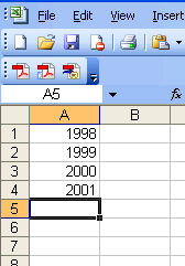 We will start by entering the time span.
In cell A1 type 1998 and press [enter].
In cell A2 type 1999 and press [enter].
In cell A3 type 2000 and press [enter].
In cell A4 type 2001 and press [enter].- continue
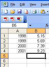 Now we will enter the data.
In cell B1 type 5.15 and press [enter].
In cell B2 type 5.69 and press [enter].
In cell B3 type 7.39 and press [enter].
In cell B4 type 9.23 and press [enter].- continue
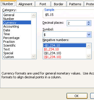 Let's take a moment to tell Excel that the values in B1:B4 are money.
Highlight cells B1:B4
Choose "Format" from the menu bar.
Choose "Cells"
Choose "Currency"
and press "OK" to finish formatting the cells.- continue
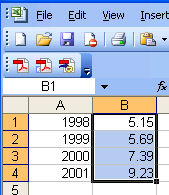 Now we will begin to make the graph.
Highlight cells B1:B4 by clicking cell B1 and dragging to cell B4.- continue
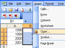 Select Insert from the menu bar then click chart on the submenu.
- continue
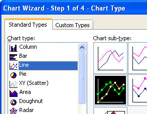 Choose Line from the Chart type section and "Line with markers..." from the chart sub-type section.
- continue
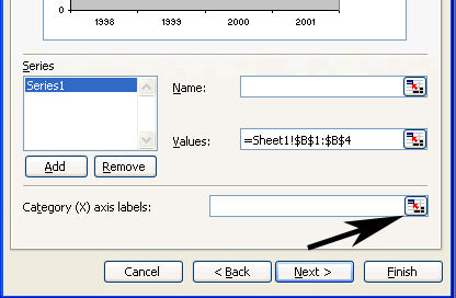 Choose Next to complete step 1.
Switch to the "Series" tab at the top of the wizard box.
Now we need to assign the "category x axis labels"
Select the button to find data from the worksheet button. (as shown in the picture on the right).- continue

Highlight cells A1:A4 and select the enter data button as shown in the picture above.- continue
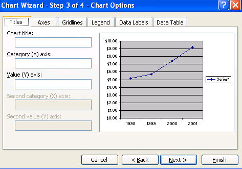
Your preview should be pretty close to the graph that we are trying to make. If you look it over, you will notice that the interval on the Y axis is not what we want and the legend needs to go away.- continue
- Enter the "Chart title:" by typing or pasting "Juan's Hourly Wages" into the Chart title text box.
- continue
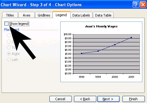
Click the "Legend" tab and remove the check in the checkbox next to "Show legend".- continue
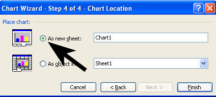
In the chart location step, we want to choose as a new sheet.
Click the radio button for the new sheet as shown in the picture above.- continue
- The graph should look pretty much like you wanted.
Let's put our name on it.
Select "View" from the menu bar.
Choose "Header and Footer"
Select "Custom Header"
Type your name into the right section.- continue
- We still need to change the interval on the Y axis so that it will match the assignment in our workbook.
Right Click anywhere on the Y axis.
Choose format axis- continue
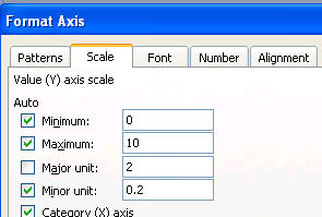 Choose the "Scale" tab at the top of the wizard and change the major unit to 2.
Press "ok" when your are finished.- continue
- Now it is time to decorate our graph to make it appealing to the viewer. You can right click and format all aspects of the graph. As you continue with this lesson, I will assist you in formatting the data series, fonts and the plot area.
- continue
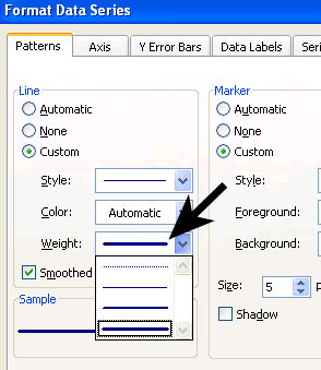 Lets start by formatting the line and its dots.
Right Click on the line and choose "format data series
I prefer a heavy weighted line, so under line weight, I use the drop down arrow to select the heaviest line.- continue
- If you wish to change the markers, do so before moving on to the remainder of the graph.
- continue
- Now lets change the font of the title, x axis and y axis.
Right Click the title.
Choose format chart title.
choose the font tab and change the font size to 16.- continue
- Right Click any number on the Y axis.
Choose format axis.
Choose the font tab and change the font size to 14.- continue
- Right Click any label on the X axis.
Choose format axis.
Choose the font tab and change the font size to 14.- continue
- Super! Now all you need to do is change the ugly gray background into something you like and you will be finished!
Right Click any blank area of the plot area and choose format plot area.
Notice the "Fill Effects" option button is available and choose light colors for your background so that your line will stand out.- Finished