Extension - Use Excel to Make Bar Graphs
Type or select your answer, then press "Check".
After a correct answer, click the => to advance to the next question.
After a correct answer, click the => to advance to the next question.
- Minimize this window
Open Excel
Then click this application on the task bar to restore this page.- It's done
- Look on your task bar. You should see "Microsoft Excel - Book 1" as one of the choices. Multitasking will require you to switch back and forth between files.

- OK
- You could try resizing the windows so that you can view both applications at the same time. Or you can read this one then click "Microsoft Excel" on the task bar to complete your assignments.
- OK
- Today we will be using Microsoft Excel to make bar graphs for various data sets.
- Proceed
- First we must enter the information into the cells as though we are going to make a table.
Let's type the title of our bar graph into cell A1
Type or paste - Favorite Color into cell A1.
Press [enter] to tell Excel that you have entered the data- Finished
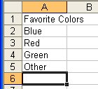 Now we will enter the categories. In cell A2 type Blue, press [enter].
A3 type Redpress [enter].
A4 type Greenpress [enter].
A5 type Other, press [enter].- Finished
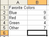 In cells B2:B5 we will enter the data.
Press [enter] after each number so that you will move to the next cell.
9, 6, 4, 7- Finished
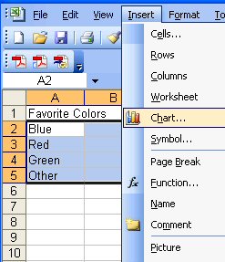 Now we must tell Excel what data we want to use to make the graph (chart).
Highlight cells A2:B5
Select Insert from the menu bar
Select Chart.- OK
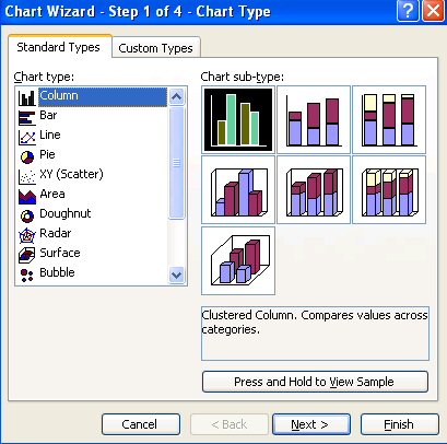 You are looking at the "Chart Wizard". Notice that Excel has Column Charts and Bar Charts.
Column Charts are the horizontal bar graphs that we are used to seeing and making so leave that alone.- OK
 There are several options in the right hand panel.
I think that the Clustered-Column with 3D visual effect is a nice graph.
Click the first chart sub-type in the second row to select this type of graph.
Then select next to move to the next step.- OK
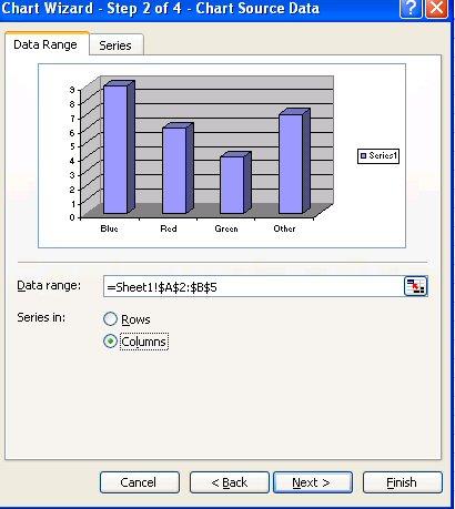 Step 2 shows a preview of the graph. We should examine it to make sure our x axis is correct.
This preview looks good to me. Does your preview look correct?- yes
- Choose next to move to step 3.
- OK
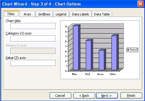 Step 3 is a multi-step wizard. I have found that students don't use this step as well as they should.
Notice the "tabs" for many different options.
We will use the "title" and "legend" tabs almost every time we hit this step!- OK
- In the text box for chart title type. Favorite Colors.
We do not need to title the x axis since the colors are self explanatory.- OK
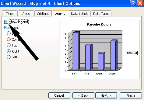 Now select the Legend tab.
We only have one type of data so we do not need a legend.
Click the check box next to "show legend" to turn off the legend.- OK
- The graph looks pretty good. Click next to move to step 4, Chart Location.
- OK
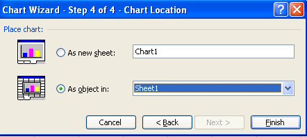 Now we must decide whether to make the chart a small object in a sheet (default) or a large graph as a whole sheet.
We will create the graph as a new sheet called Colors Graph
Select the radio button next to "As a new sheet:"
The replace Chart1 by typing Colors Graph into the text box.- OK
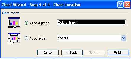 Click Finish to create the graph!
- Complete
- We need to put our name on the graph.
Click "View" from the menu bar
Click "Header and Footer"
Click "Custom Header" and put your name in the right hand section.
Click "OK" to complete the custom header.- Finished with Header
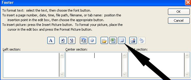
Let's put the name of the worksheet into the footer.
Click "Custom Footer"
Click in the center section, then choose the icon that looks like an index card with tabs on the bottom.
The result should be "&tab"
Choose "OK" to complete the footer.
Choose "OK" to finish working with the header and footer.- Proceed
- Our graph is finished. It is time to make it look snappy.
The first decision is whether we want our graph to be printed in black and white or color.
Since this graph is about favorite colors, I think a color graph will be nice.
As I make modifications to the formats, I will choose colors and effects that will make for an impressive color graph!- Ready
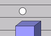 Right Click any gray area on the walls that you want.
If you look at the model on the right, I have drawn a circle to show you an example of where to click.
Choose "format walls.- OK
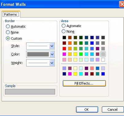 You could choose a solid color or click "fill effects" to really make your graph special.
We will choose fill effects to learn more about this option.- OK
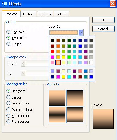 For the background we will want a light color or pattern.
Yellows are not a part of the graph choices so we will use yellows for our background.
Choose the radio button for Two Colors.
Choose tan for color 1 and gold for color 2.- OK
- The default shading style is "Horizontal" with gold on the bottom blending to tan on top.
That is perfect for our graph so we will click "OK" and "OK" to finish formatting the walls.- Nice
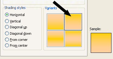 We need to follow the same procedure to jazz up the "floor".
Right Click any blank area on the floor.
Choose "Format Floor"
Choose "Fill Effects
Choose "Two Colors"
Choose "tan" for color 1 and "gold" for color two.
Before you click OK, change the shading style variant to the one in the upper right hand corner as shown!
Choose "OK" and "OK" again to finish formatting the floor.- Nice
- Let's spruce up the bars now.
To select individual bars you need to click the bar once...wait a second and click it again.
You will notice that the first click selects all of the bars.
The second click singles out the bar you want to work on.- Success
- Right Click the blue bar and choose format data point.
If the option says format data series, click the wall and try to single out the blue bar again by going back to question 27.- I got it
- Choose two "blue colors" and any shading variant you want.
Complete the decoration for each of the "colors".
Use vibrant colors to stand out against your background.
When your graph is finished, select Finished below to move to question 30 and find out why Excel graphing rules!- Finished
- You have made an awesome graph and are very excited about it. You show it to your partner and he says, "Um, you forgot purple! There are 3 students who chose purple!"
Yikes! All of that work and you won't get an A!
Don't panic, Excel has the answer for you.- Show me
 Click the tab for Sheet1 to return to the data for the graph.
- OK
- We will put purple between red and green.
Click the "4" to select the entire "green" row.
Choose "Insert" from the menu bar and choose "Row".- OK
- Type "Purple" into cell A4 and "3" into cell B4.
Press [enter] to tell Excel that you are finished.- OK
- Now go back to the Colors Graph page and make the purple bar look beautiful!!
- Awesome!
- Print your graph or save your file and bring it to school to print!
- Cool